Design systems
The inconsistency tax
Thirty minutes on a cost you can name this week.
Christoph Hellmuth · Design Engineering Studio
Leave this up while people sit. Say your name, say the studio, and say what the half hour is for.
This is a talk about money and craft at the same time. Inconsistency is not a taste problem that design complains about in a retro. It is a repeat purchase. You pay to invent a pattern, then you pay again because the next squad cannot find it, does not trust it, or quietly builds a cousin.
I am Christoph. I have spent sixteen years in the seam between design and code, including design systems at Nord, where Aurora is used by dozens of teams and hundreds of people. The number I want in the room from the start is from Flyeralarm: one consistency fix cut reclamations by about 90 percent. We will get there. First I want you to see the invoice you are already paying.
If you lead design, engineering, or product at a company that has more than one squad shipping UI, this is for you. If you are the person who keeps getting asked to "just make it consistent," it is also for you. You should not have to carry that alone.
The point
You are paying twice for the same button.
The second invoice is the one nobody puts in the sprint.
Start here, before any framework. Ask them to picture one button. Primary, the one that takes money or submits the form.
Someone designed it. Someone built it. Then a second squad needed the same action on a different surface and could not tell which file was current. They made another. A third showed up in a marketing page because the component was too hard to reach, or too strict, or simply unknown. Support now answers tickets about a control that looks disabled and is not, or looks primary and does nothing.
That second and third build is the tax. The design review that re-argues the same spacing is the tax. The week a new engineer spends learning which of four buttons is the real one is the tax.
I am not asking you to feel bad about craft. I am asking you to count. Quick hacks compound. So do systems. You are already compounding. The only choice is which one.
Say that last line slowly. Then go to the photograph. Do not explain the metaphor before they see it.
Every letter has a slot.
Let the picture sit for a few seconds. It is a printing shop in 1899. The cases in front of them are the system. Each letter has a slot. You do not hunt through a pile and hope you picked up the same e as yesterday.
Say this: a design system is that case, for interface. A button, a space, a color, an error, each one has a slot, a name, and a place you put it back.
If the case is empty, or unlabeled, people still set type. They just set it from memory, and the page comes out different every time. That is not a failure of effort. The compositors in this room are working hard. The work is hard because the slot is missing.
Our photographs are specimens, not decoration. This one is public domain, Frances Benjamin Johnston, Library of Congress. Leave the credit off the plate. The line is ours. The picture stays the picture.
Then: for the next few minutes I am going to name the invoice, then show you where it leaks, then give you a ninety-day sequence you can run without a rebrand.
This room
You are past the size where everyone knows everyone.
The system used to be a person. That person is now in four meetings.
Name the moment this becomes urgent. Early on, consistency is a person. The founding designer, or the first front-end engineer, holds the product in their head. They review everything. It works, and it feels like culture.
Then you hire. Two squads, then four. A marketing site beside the app. Maybe a second product after an acquisition, or a mobile surface that was "temporary." The person who held it is now in planning, hiring, and a redesign. They still care. They cannot touch every pull request.
This is the point where teams tell me the UI looks different in every squad. Design files and production drift. Onboarding is slow because "how we build UI here" lives in chat. Leadership agrees a system would help, and then feature work eats the quarter.
If that is you, you are not late, and you are not undisciplined. You outgrew a memory. The next step is to make the memory into something a new person can open on a Tuesday.
I work with scaling product teams, mostly in DACH and the EU, in that exact gap. The offer at the end of this talk is a conversation, not a pitch. Stay with the cost model first. People fund what they can estimate.
Thirty minutes
Four parts. Then questions.
- 05
Name the taxFour places the money actually goes.
- 12
Where it leaksThe symptoms you can see in a sprint.
- 18
What a system isA slot, a name, an owner, a door.
- 24
Ninety daysA sequence that does not wait for a rebrand.
Read the four parts without decorating them. Tell them the times are a promise to you, the speaker, so you do not spend twenty minutes on the diagnosis and six on the fix.
Part one is a cost model: rebuild, review, support, onboarding. You can take it back and put rough numbers on it this week. I will not pretend I know your hourly rate.
Part two is the leaks I hear in almost every first call. If none of them match, you may not have this problem. That is a useful result.
Part three is a definition small enough to fund. Not a library of a thousand components. A slot, a name, an owner, and a door.
Part four is ninety days. Week one, day thirty, day sixty, day ninety. Honest about what I would not fund.
Questions at the end. If you want the script I am reading from, the N key opens it. That is for later, if you reuse this deck.
Move.
Part one
Name the tax
If you cannot point at it, you cannot fund it.
Short beat. Say: leadership does not fund "better Figma." Leadership funds rework you can stop. So we name the rework before we name the tokens.
Do not apologize for talking about money. Craft without a cost model stays a side project. A cost model without craft becomes a cheap component dump. You need both. That is the whole studio, in one sentence: systems thinking with craft.
Advance.
The invoice
Four places the money goes.
- 01
RebuildThe same pattern, built again, because the first one could not be found or trusted.
- 02
ReviewDesign and code review spent re-deciding spacing, color, and states.
- 03
SupportTickets and refunds caused by UI that lies, or flows that do not match.
- 04
OnboardingWeeks before a new designer or engineer knows which pattern is real.
Walk the four buckets slowly. Tell them these are the ones I ask a team to estimate, not a fantasy ROI spreadsheet.
Rebuild is the obvious one. Search the repo for Button, or for the same hex used three ways. Count the near-duplicates. Multiply by the time to build and review one of them. You will not get an accountant's number. You will get a range that is already larger than a foundations sprint.
Review is sneakier. Senior people in a critique arguing about eight pixels that were argued last month. That hour is expensive, and it teaches the team that nothing is decided.
Support is where inconsistency becomes a customer cost. A form that looks submittable and fails. A setting in the app that the marketing site describes differently. At Flyeralarm the expensive version of this was bad print data, and the fix was systematic correction, not a nicer error string. About 90 percent fewer reclamations. Hold that for the proof slide. Here, just put support on the list so finance recognizes it.
Onboarding is the quiet one. Every new hire pays a tuition to the undocumented system. If you hire four people this year, you pay it four times.
Say: pick one squad and one month. Ask engineering to star the pull requests that rebuilt something the product already had. That list is your first estimate. Then we will look at each bucket on its own, quickly, so you know what to ask.
Rebuild
The second build is not a new idea.
It is the first idea, with the name filed off.
Tell a concrete version. A squad needs an empty state. The design system, if there is one, has an empty state that requires three props and a trip through a doc that drifted. The squad draws a new one in two hours. It ships. It is fine. Next quarter another squad does the same.
Nobody was lazy. The slot was harder to use than the blank file. That is a system failure, not a discipline failure. If contribution is slower than forking, people fork.
When you estimate rebuild, do not only count net-new components. Count the variants that are the same component with a different border. Count the modal that is a copy of the dialog with the close button moved. I have seen teams with a handful of real patterns and dozens of files that pretend to be new.
The fix is not a speech about reuse. The fix is a path that is faster than the copy. We will talk about that door in part three. For the estimate, write down how many times last quarter you shipped a cousin.
Land this: the second build feels cheap in the sprint. It is expensive across the year, because now you maintain both, and they will diverge the first time someone fixes a bug in one.
Review
Critique spent on settled questions is waste.
Taste belongs on the undecided. The rest should be a check.
This is the bucket senior people feel in their calendar. A design critique where half the comments are "we usually use this gray" or "the button should be the other button." Those are not taste. Those are missing names.
Separate the two kinds of review. One is a decision: should this flow exist, is the hierarchy honest, did we design the error. That deserves the room. The other is a check: does this use the action color, the space scale, the focus ring, the component that already has the six states.
If the check is still a debate, you do not have a decision on file. You have a vibe. Vibes do not survive a new hire.
Ask design leads in the room how many hours last week they spent on checks that should have been mechanical. Do not let them answer out loud unless you have time. The wince is enough.
Engineering review has the same split. A pull request that restyles a div because the component was annoying is a design-system bug showing up as a code review comment.
Say: I would rather your seniors spend critique on the product, and let a token and a component make the settled things boring. Boring is the point.
Support
Customers pay the tax in confidence.
When the interface disagrees with itself, people stop trusting the action.
Shift from internal cost to external cost, briefly. Inconsistent UI is not only ugly. It makes people hesitate. Two primary buttons on one screen. A destructive action in the same color as save. An error that looks like helper text. A price in the app that does not match the page they came from.
You do not need a giant research study to take this seriously. Pull ten support tickets that mention "I thought it was" or "the button" or "it looked different." Read them. If the product is a transaction, look at refunds and failed tasks, not only at visual QA.
The Flyeralarm story belongs here as the sharp version, and I will give the number on the next proof slide so it has room. The short version: the expensive inconsistency was not a color. It was print data that failed in ways the customer discovered too late. The team built an automatic correction. Reclamations dropped by about 90 percent. The lesson I carry into interface work is that a systematic fix beats another round of manual checking.
For a software product, the cousin of that fix is: one component for the risky action, with states designed before decoration, and copy that matches what the system will actually do.
Do not invent a percentage for their business. Offer the method. Tickets, refunds, task failure. Then a single repeated pattern you could make trustworthy.
Onboarding
Every new hire pays tuition to the old mess.
Tribal knowledge feels fast until the person who holds it is out.
Onboarding is where the tax becomes a hiring plan. You can hire talented people and still wait a month before they ship UI that looks like yours. They are not slow. The map is in someone's head, and in three Figma files named final, final-2, and the one engineering actually used.
Ask: what would you hand a designer on day two? If the answer is "shadow Maya for two weeks," you have a person-shaped system. Maya is great. Maya goes on holiday.
A usable system is an import. Day two, they can open the library, see the button with its states, see the token names that match the repo, and know who to ask if the component is wrong. Not a hundred-page PDF. A door.
I will not claim a universal number of days saved. I will say this: if onboarding UI takes weeks, part of that week is the inconsistency tax, and you will pay it again on the next hire. Write it into the estimate as a range. Two days or ten. Even the low number, times the hires you plan, is a budget line.
Land it: the system is how the team remembers, when the people change.
Same drawing. Many tables.
A room of people doing the same kind of work, each with a drawing. The point is not nostalgia. The point is that a shared task needs a shared original. If every table invents the sheet, the building does not go up square.
Say: your squads are these tables. The product is the building. The drawing has to be the same drawing, or you are coordinating by walking around and tapping shoulders. That works in one room. It fails when the tables are in different time zones and the person who remembers the drawing is in a planning meeting.
Public domain, U.S. National Archives. No credit line on the plate.
Transition: you have the four buckets. Here is one number from real work, so the model does not stay abstract.
A number you can use
About 90 percent fewer reclamations.
One systematic fix at Flyeralarm. Not a mood board. A correction the product could repeat.
Give the proof room. Do not rush it, and do not inflate it.
At Flyeralarm, the work included design systems and UX, and an industry-first automatic print-data error correction. It cut the reclamation and refund rate by about 90 percent, and it unlocked significant revenue. I say "about" because that is the honest published figure. I do not add a euro amount that was not published.
What matters for this room is the shape of the fix. The team did not ask people to be more careful. Careful does not scale. They built a correction that ran the same way every time, and they removed a class of failure the customer used to discover after they had paid.
Translate that into UI without pretending a button library is a print pipeline. Look for the failure you currently catch by hand: mismatched components, inaccessible states, a token that exists in Figma and not in the repo, a pattern support has to explain twice a week. Make the correction repeatable.
Pair it with a second, smaller proof so they do not think only print businesses qualify. On another project, Lighthouse performance went from 34 to 77. Part of that was system discipline: fewer one-offs, less CSS chaos. Performance was not the slogan. It was what happened when the interface stopped being a pile of exceptions.
Two numbers. One customer-facing, one engineering-facing. Both came from making the repeated thing the same thing.
Then: quick hacks also compound. A local fix that is not named becomes the next team's starting point, and the tax grows. You are choosing a compounding rate either way.
The choice
Both compound. Pick one.
HackFaster this weekA local copy. A one-off hex. A note in chat. It ships, and next month it has a cousin.
SystemFaster next quarterA named slot, used twice, with an owner. The third use is cheaper than the first.
Do not moralize the left column. Hacks are how teams survive a deadline. I have shipped them. The problem is leaving them unnamed, so they become the de facto system.
The right column is not "stop feature work and build a perfect library." It is: the second time you need it, put it in the slot. The third time, the slot pays you back.
If a leader says they cannot pause the roadmap, agree. The ninety-day sequence later is designed to run beside feature work, on one path, not on the whole product. You do not boil the ocean. You stop paying twice for the next button that matters.
A question I ask in the room, if there is time: which pattern did you rebuild in the last month? Write the name on a board. That name is the pilot. Not the logo, not the illustration set. The thing you already paid for twice.
Hold the pair on screen while you say that. Then the photograph.
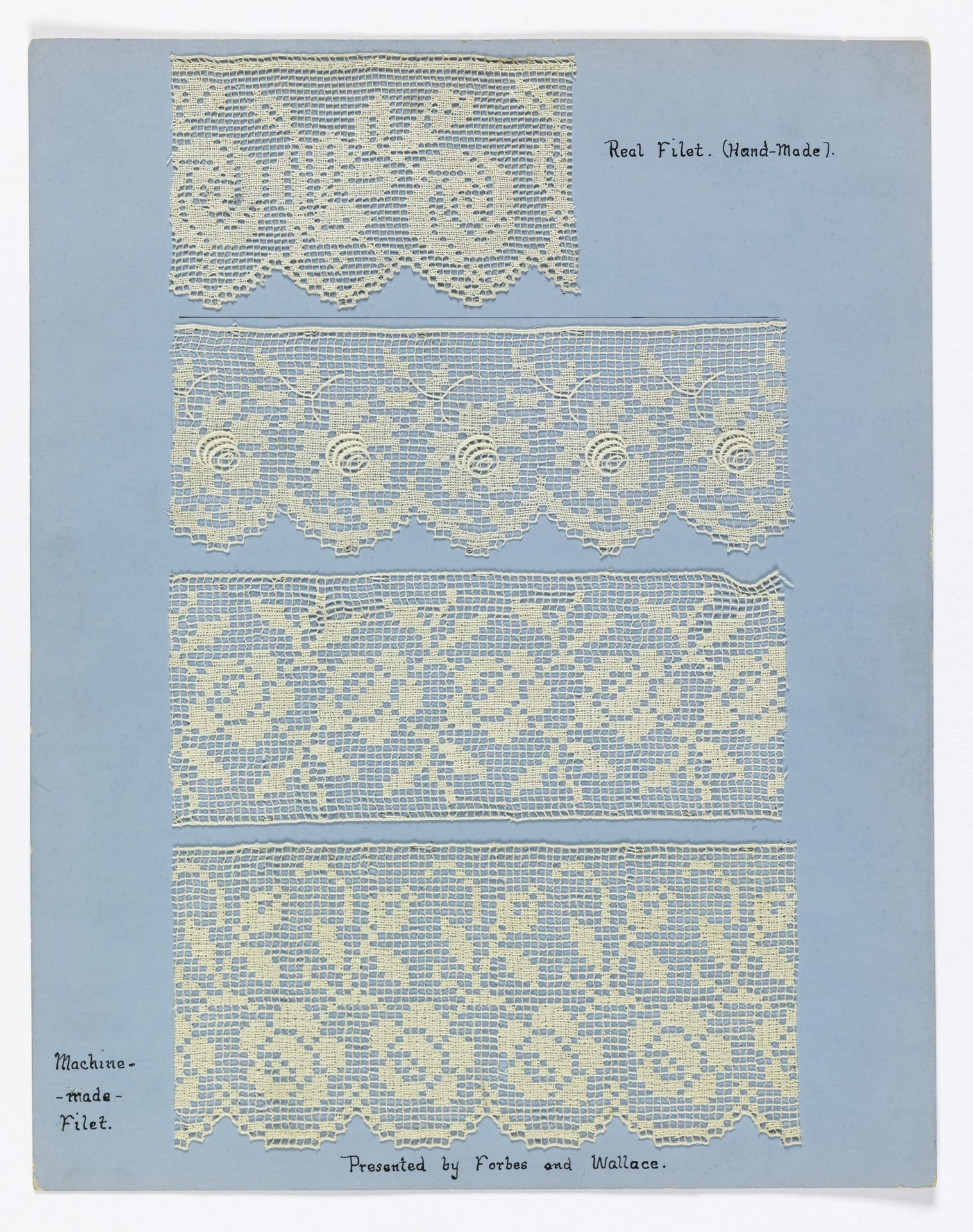
Hand-made and machine-made, both named.
This is a sample board, about 1910. Hand-made filet and machine-made filet, labeled, on the same sheet. The craft is not pretending the two sources are the same. The craft is naming both so nobody argues from memory about which is which.
Say: your Figma file and your repo are the two sources. A single source of truth, as a slogan, usually means one JSON in a drawer nobody opens. What works is both sources named, and a check that tells you when they disagree.
We will not go deep on tokens in this talk. That is the next talk in this series. Here, the lesson of the sample board is enough. If you cannot tell the hand-made screen from the system screen, you will "fix" the wrong one.
Public domain. No credit on the plate.
Transition into part two: now the leaks, the ones you can see without an audit spreadsheet.
Part two
Where it leaks
Four symptoms. If you have two, you are paying.
Tell them this list is from the same problems I hear on first calls, and from the homepage, because I would rather repeat a true symptom than invent a new framework.
If they recognize none of these, good. Use the questions at the end to find the actual leak. Do not sell a system to a team that has a different problem, like a missing product strategy. A design system will not pick their market.
Advance to the list and read it in their language, not as a slogan stack.
Symptoms
You can see these in a sprint.
- 01
Every squad, a different UINo shared tokens, components, or docs. Every screen is a one-off.
- 02
The file and production driftEngineers rebuild patterns, or ship a variant the design never had.
- 03
Onboarding is a chat threadHow we build UI here lives in people, not in a place you can open.
- 04
The system keeps losing to featuresEveryone agrees. Priorities, governance, and adoption stall.
Read each one and add one sentence of what it feels like, so it is not a poster.
Every squad, a different UI: open three flows that all collect an address. Count the fields, the errors, the buttons. If you need a narrator to explain why they differ, that narrator is the tax.
The file and production drift: ask an engineer which Figma is safe to implement. If they pause, you have drift. Drift is not a moral failure of handoff. Handoff is a teamwork problem. Shared language, a ritual, and a check beat a thicker spec.
Onboarding is a chat thread: search Slack for "which button." If that search has a history, you are paying tuition.
The system loses to features: this is the one leaders cause with good intentions. The system is framed as a project that starts when there is time. There is not time. So the system has to be a constraint on feature work, small enough to fit in the quarter, with an owner who can say no to a fourth button.
Say the turn I use with teams: it does not have to be this way. Then tell them the leak I want to spend the next slide on, because it is the one people defend.
The leak I would pick
You do not have to ship four buttons.
One of them is the product. The other three are the tax, still in the interface.
This is the slide I want them to remember if they remember one diagnosis.
Teams defend the four buttons. This one is for marketing, this one is older, this one is the dense app, this one is the experiment. Sometimes that is real. Often it is four answers to the same question, none of them retired.
A design system is allowed to be strict. Strict is a kindness to the next squad. The button has a name, a limited set of variants, and states: default, hover, focus, active, disabled, loading. If a screen needs something else, that is a decision with an owner, not a quiet fork.
I led Aurora at Nord. It is used by dozens of teams and millions of users. The work was never only pixels. It was reducing friction so those teams could ship without each one inventing the button. I share that so you hear scale, not a portfolio adjective. The same rule holds at twenty people: one button, named.
If you want a workshop exercise and you have ten minutes after this talk, put the four buttons on a wall and ask which one support trusts. Build that one. Deprecate the others with a date. Deprecation is part of the system. A library that only adds is a junk drawer.
Land: the fourth button is not variety. It is an unpaid decision.
Two machines. One measure.
Two of the same machine. Type comes out the front. The point of a standard is that the second machine does not get a personal interpretation of the letter.
Say, briefly: design and engineering are the two machines. If they use two measures, you will spend the retro aligning output that should have matched. One measure: tokens in the file and in the repo, components with the same names, states specified before visual polish.
Public domain, State Library of New South Wales. No credit line.
Into part three. Definition, small enough to start.
Part three
What a system is
Small enough to fund. Strict enough to help.
Reset the room. A lot of people hear "design system" and picture a six-month program, a committee, and a Figma file that launches to silence.
Say what it is not. It is not a brand book. It is not a sticker sheet. It is not a ban on judgment.
Then the next slide is the four words: slot, name, owner, door. Keep this section moving. You want time for the ninety days.
A definition
A slot, a name, an owner, a door.
- Slot
One place it livesThe component in the repo, and the component in the library, are the same idea.
- Name
The decision, not the hueAction, not blue-500. The name says what it is for.
- Owner
A person who can say noNot a committee. Someone who accepts the change or sends it back.
- Door
A way in that is faster than a forkContribution, a checklist, a review. Otherwise people copy.
This is the definition I want them to leave with. Four words.
Slot: if there are three repos and five Figma files, pick the one path you will make true first. A system that claims to cover everything on day one covers nothing. Aurora could serve dozens of teams because the slot was real, not because the slide deck was inspiring.
Name: primitive values exist, the indigo, the space steps. The name a product team should reach for is the role. Action, danger, surface, focus. A chip without a name is only paint. You can feel this in the next photograph. Do not preview it.
Owner: governance dies when everyone owns it. One person, or one pair across design and engineering, with time in the week. They are not a service desk for screens. They keep the slot honest.
Door: write down how a squad proposes a variant. If the answer is "ask in Slack and hope," you will get forks. A short checklist beats a council. I go deeper on this in the governance talk. Here, just make the door part of the definition so nobody thinks the library is the whole system.
Say: if you have those four for one component, you have started. If you have a hundred components and none of the four, you have a folder.
Connect it back to the tax. The slot stops the rebuild. The name stops the review debate. The owner stops the drift. The door stops the tuition, because a new person can see how a change happens.
Name the color, then use it.
Albert Munsell, 1915. The chart names the color. It does not say "use the nice blue." It gives the branch a name so two people can point at the same chip.
Say: this is the whole token argument in one plate. Name the role, then point at the value. If the name is the hex, you cannot have a second theme, and you cannot talk about the decision in a meeting that does not want to hear hex codes.
Public domain, Smithsonian Libraries. No credit line.
Do not open a token architecture lecture. Point them at the tokens talk if they want the layers. Come back to the product: the name is what makes the button discussable.
One more proof, then the plan.
A side effect
Lighthouse 34 to 77 was not a trick.
Fewer one-offs. Less CSS that only one screen understood.
Keep this honest and short. I am not selling performance as the reason to build a system. I am saying the system showed up in a number engineers respect.
From 34 to 77. Part of that lift was system discipline. One-off styles are weight, and they are also inconsistency, because nobody knows which rule wins. When the interface is made of shared pieces, you delete more than you add.
Mention the bench only if someone asks about AI later. The open design system bench graded 898 generations across four systems, and nobody was AI-native yet. The relevant point today: a model will copy your mess at speed if the slot and the name are not real. Governance is not a later chapter. It is what keeps the speed from multiplying the tax.
If you are under time, cut the bench sentence. Do not cut the Lighthouse numbers. They are specific, and they are true.
Then: you have the cost, the leaks, and a definition. Here is how I would spend ninety days if I joined you on a Monday. Not a transformation. A sequence.
Part four
Ninety days
Beside the roadmap. One path, then the next.
Promise the shape. This is not a freeze on features. It is a rule: the next time we touch this path, we touch it through the slot.
Say you would rather start with a painful, repeated flow than with the brand. The brand can come along. It should not be the excuse to wait.
Go straight into the steps.
A sequence
What I would do in ninety days.
- 01
This week: name the leaksOne squad, one month, four buckets. A range, not a fantasy.
- 30
Day 30: one path, one buttonThe flow you rebuilt. States included. The cousins get a deprecation date.
- 60
Day 60: the file and the repo agreeSame names. A check for drift. Not a new source nobody opens.
- 90
Day 90: a doorAn owner, a checklist, and a way for the next squad to add without forking.
Spend real time here. This is the part they can steal.
This week: sit with one engineering manager and one designer. Pick a squad that shipped UI last month. Sort the work into rebuild, review, support, onboarding. Use hours, even rough ones. Bring the range to whoever holds the budget. You are not asking for a platform team. You are showing an invoice.
Day 30: choose the path from that estimate, the one you paid for twice. Build or repair one button, or one form, or one empty state, with the states, in Figma and in code, same name. Write down what you will not support. Give the old versions a date. If you finish day 30 with a slide about principles and no component in the repo, you have not started.
Day 60: make the names match. Action in the file, action in the code. If you want a check, make it mechanical: a diff, a test, a small script. A meeting called "alignment" will drift again by day seventy. I do not believe in a single source of truth as a myth. I believe in two sources that are checked.
Day 90: name the owner. Give them a few hours a week, in public. Publish how to propose a change in less than a page. Run one contribution from a squad that does not own the system, so the door is proven, not described.
Say what this is not. It is not a rebrand. It is not a committee of twelve. It is not a ban on new ideas. A new idea comes through the door, with a name.
If they only do the first thirty days, they are still ahead of a team that commissioned a library and adopted nothing. Adoption is the product. The files are the means.
Watch the clock. If you are long, deliver day 30 and day 90 and point at the slide for the middle.
What I would not fund
Do not start with a museum.
A library nobody imports is a folder with good taste.
Give them permission to say no. This builds trust.
I would not fund a six-month component museum before a single product path uses it. I would not fund a rebrand as the moment you found the system. A rebrand is a bad week to invent governance. The visual change can ride on slots you already trust.
I would not fund a tool argument as the first month. Figma versus code, or which token format, matters, and it is not the leak. The leak is four buttons and no owner.
I would not fund "the AI will generate the system" as a substitute for the slot and the name. Speed without a contract multiplies cousins. Use the tools. Keep the owner.
I would not ask one designer to do this at night on top of the roadmap. That is how systems die and how people leave. The owner needs time in the week. If you cannot spare the time, you have decided to keep paying the tax. That is allowed. It should be a decision, not a drift.
Land: honest next steps beat a big program that starts in Q3 and is still a kickoff in Q4.
Find it by the name, not the pile.
The catalog is how you find the book without knowing which stack it is in. Your team should find the button by its name, not by asking who drew it.
Say: if they cannot find it, you do not have it. That sentence is the adoption test. We will use it again in the governance talk. Here it closes the loop on the tax. The second invoice happens because the first decision is in a pile.
Public domain. No credit line.
Then the ask, plain, and the close.
Honest next steps
Estimate one month. Then fix one path.
If you want a second pair of eyes, the consult is thirty minutes and it is free.
Tell them exactly what to do on Monday, even if they never call you.
Monday: pick the squad and the month. Fill the four buckets with ranges. Circle the pattern that shows up in more than one bucket. That is the pilot.
If they want help, the door is a free consultation. Thirty minutes. No pitch. Concrete observations either way. The line on the site is "Get a free consultation." Say that, do not invent a second offer. If the fit is an audit, you can say the audit exists, fixed scope, and that you will only recommend it if the conversation shows a real leak. Do not quote a price from the stage unless they ask. If they ask, the audit is a few days, and the fee is credited toward a build. Keep it light.
Point at the other talks if this series is running together: tokens, if the names are the mess; design engineering, if they are hiring the seam; governance, if they already have a library nobody uses.
Land the close on the next slide. Do not add a thank-you paragraph. The line does the work.
Design Engineering Studio
Pick which compounding you want.
Quick hacks compound. So do systems.
christophhellmuth.com
Read the two sentences. Stop. Let them sit.
Then: I will take questions. If you want to talk about your four buttons specifically, come up after, or write. post@christophhellmuth.com.
Do not summarize the whole talk again. They just heard it. If the room is quiet, offer one question you can answer without a prompt: which bucket is the largest for us, and how would we know in a week?
Stay on this slide through the questions.
Questions
What are you paying for twice?
Bring a pattern, a squad, or a number. Leave the theory.
Use this slide if you want a written prompt behind you during questions. Repeat the question on the slide once, then listen.
Good answers to common questions, if they come:
What if leadership wants a rebrand first? Let the rebrand change the values in the slots. Do not found the governance in the same week you change the logo. Map the slots you already have, even if they are informal, and pour the new color through the names.
What if design and engineering do not get along? Do not start with a tool. Start with one review both attend, on one component, with the states written down. Handoff is teamwork. A thicker spec will not fix a room that does not share a language.
How big should the team be? One owner with time, and the squads as contributors. A platform team of ten with no door is just a new silo.
Is this only for large companies? No. The tax starts when the second squad cannot see the first squad's decision. That can be fifteen people.
When the questions end, go back to the close line if you need a last beat: pick which compounding you want.
The clock on this deck includes this conversation. If you started on time, you should be at the half hour as the room stands up.