Design systems
Tokens that survive handoff
A name, a value, and a check. Thirty minutes.
Christoph Hellmuth · Design Engineering Studio
Open by telling them this talk assumes they already feel the inconsistency. If they have not priced it, the inconsistency tax talk is the one to hear first. This one is the contract underneath the button.
I am Christoph. Design engineer. Sixteen years between the file and the repo, systems work at Nord on Aurora, dozens of teams, millions of users. The promise of this half hour: you will leave with three layers of names, a reason the single source of truth usually fails, and a week you can run so the file and the code stop drifting.
Tokens are not a plugin feature. They are how a decision travels. If the decision stays a hex in a frame, the next squad will guess.
Say your name, then the line on the next slide. Do not teach the layers yet.
The point
A hex nobody opens is not a system.
The value can be right and the contract can still be missing.
Say it plain. I have seen beautiful JSON. Three hundred tokens, exported, committed, and unused. Designers still pick swatches by eye. Engineers still paste hex into a module because the token name did not say what it was for.
That file felt like progress. It was a drawer.
A token that survives handoff has three things. A name a human can say in a review. A value that can change without a hunt through screens. A check that fails when Figma and the repo disagree.
If you only remember one sentence, remember the name. Name the role, then point at the hex. Blue-500 is paint. Action is a decision. You can rebrand the paint. You should not have to rediscover the decision.
We will do the layers, then the sync, then a week. Questions at the end. The photographs are specimens of naming, catalogs, and machines that read a record. They are not slides about history for its own sake. Watch what is labeled.
A chip without a name is only paint.
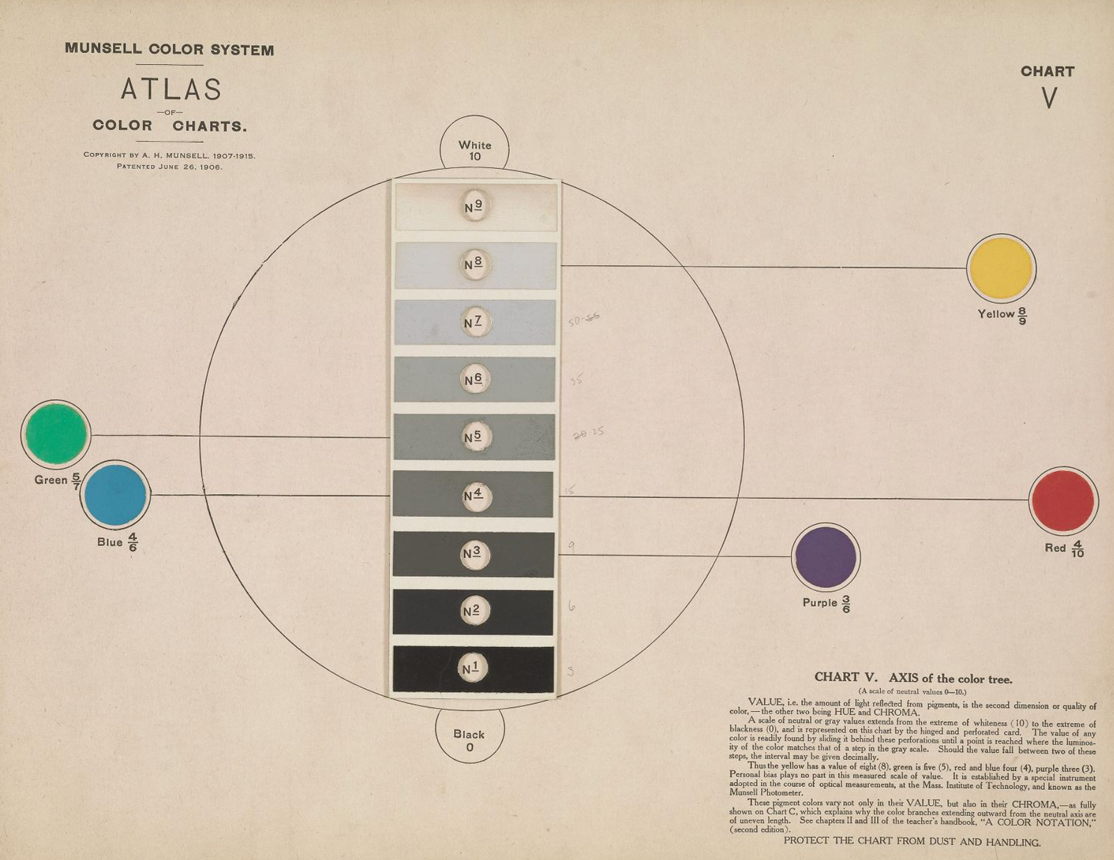
Munsell again, the flatter chart. CC0, Smithsonian. No credit line. The chips are organized so you can point. A loose pile of nice colors cannot be handed to another room.
Say: your brand palette is the paint. It belongs in the system. It is not the system. The moment a product screen says "use the blue," you have started an argument. Which blue. The marketing blue, the focus blue, the link that failed contrast.
Hold the picture. Then: three layers. I will keep the words boring on purpose. Primitive, semantic, component. If your team uses different words, map them. Do not invent a fourth layer to sound thorough.
Three layers
Paint, decision, part.
- 01
PrimitiveThe scale. Indigo, space, type sizes. Rarely used raw in a screen.
- 02
SemanticThe decision. Action, danger, surface, focus. This is what product design reaches for.
- 03
ComponentThe part. Button background, field border. It points at a decision, not at a hex.
Teach this slowly. Draw it in the air if you need to: primitive at the bottom, semantic in the middle, component on top. Arrows only go upward. A screen should not reach past a component token into a raw hex, and a component token should not invent a new color that semantic does not know.
Primitive: the palette and the measures. A blue ramp, a set of spaces, a type scale, a radius if you truly need one. These change when the brand changes, or when you fix a ramp. Product screens do not mention them. If a designer is typing blue-600 into a button frame, the layer is leaking.
Semantic: the decision in words a review can say. Color action, color danger, color surface, color text, color text muted, focus ring. Space for stack, space for inset. You can theme these. Dark mode is a second map of the same names, not a second product. I will spend a slide on that so nobody treats dark as a vibe you paint at the end.
Component: button primary background points at color action. Input border points at color border. The component token exists so a button can change without you hunting every screen, and so a screen cannot quietly restyle the button with a local hex.
Say the failure I see most: teams build primitives, skip semantic, and alias component tokens straight at the ramp. Then a rebrand, or a contrast fix, becomes a treasure hunt. Or they build semantic names and never connect them to components, so the names live in a doc and the buttons live in a paste.
One rule: if you cannot explain a token in one sentence without the hex, the name is wrong.
Aurora had to work for dozens of teams. The names were the only way those teams could share a decision without sharing a desk. You do not need that scale to need the layers. You need them the day the second product wants the same action in a different theme.
Primitive
The scale is not the interface.
Keep the ramp. Do not let screens shop from it.
A little more on primitives, because this is where tidy teams get stuck.
Build a ramp you can defend. Enough steps to hit contrast, not so many that blue-430 and blue-440 both exist. Name them dully. Color blue 500. Space 4, 8, 12, 16, if that is your step. I like a scale people can remember. The essay line I use is 4, 8, 12, 16. If your product needs a denser scale, write the reason down. Do not let a frame invent space 13.
Primitives are allowed to be brand-true. The studio indigo, the paper, the ink. Those are facts about the identity. They are still a bad thing to sprinkle through product UI as raw values. A marketing page can be more particular. The app should speak in roles.
Who edits primitives? Rarely. A brand change, a contrast audit, a new theme's ramp. Not a squad on a Thursday.
If you are starting from a mess, do not boil the ocean into forty ramps. Extract the colors that already ship, name the ones that repeat, and alias the rest. A perfect ramp that ignores production will be ignored back.
Land: the scale is the material. The screen is not allowed to go shopping in the material bin.
Semantic
Name the decision, not the hue.
Action, danger, surface, focus. The hex is a detail under the name.
This is the layer I will defend if we only have time for one.
Semantic tokens are the language of the review. "This should be danger, not action." You can say that to a designer and an engineer and a product manager. "This should be red-600" starts a fight about taste and ends in a one-off.
A short set beats a clever set. Color background, color surface, color text, color text muted, color border, color action, color action text, color danger, color focus. Add only when a real screen has a decision you cannot say with those. Data color is not brand color. A chart that needs a series palette should say so, in names that do not pretend to be the button.
Write the sentence next to the token. Color action: the control that moves the task forward. If you cannot write the sentence, you are not ready to add the token.
Themes are maps from these names to primitives. Light map, dark map. Same names. If dark mode introduces new decisions, you have a second product, and you will not keep it in sync. I have watched teams design light with care and then invert it on a Friday. Inversion is not a theme. A theme is a second map you check for contrast the same way you checked the first.
Aliases are how themes stay boring. Boring is success.
Say: the brand color is not automatically the action color. Sometimes the brand is a deep indigo that fails as a small text link, or shouts too hard on every button. Put the brand in the primitive layer. Choose action on purpose. That choice is the design.
Component
The part points at the decision.
Button background is color action. It is not a new blue.
Component tokens are optional until the component is shared. Do not tokenise a one-off marketing section into dust. Do tokenise the button, the field, the banner, the thing that appears in ten screens.
The component token is a seam. Design can change the decision it points at. Engineering can implement the part once. A screen that needs a special button is a request, not a local override with an arbitrary value. Overrides are how the tax comes back.
Keep the list short. Button primary background, button primary text, button danger background, input background, input border, input text, focus ring. If your token file is longer than the component API, you have moved the mess into JSON.
Document the states with the tokens. Default, hover, focus, active, disabled, loading. Disabled is not opacity sprinkled in the consumer. Loading is not a spinner someone pasted. If the token set cannot express the state, the state will be a one-off, and the one-off will ship.
Connect to code without a tool lecture. In the repo these are CSS variables or a theme object. The name matches. Color action in Figma, color action in code. If the names diverge, you have two languages, and handoff becomes translation. Translation is where intent dies.
Land: a component token that secretly holds a hex is just a primitive in a costume. Point it at semantic. Then the costume can change with the theme.
Style number, then the mix.
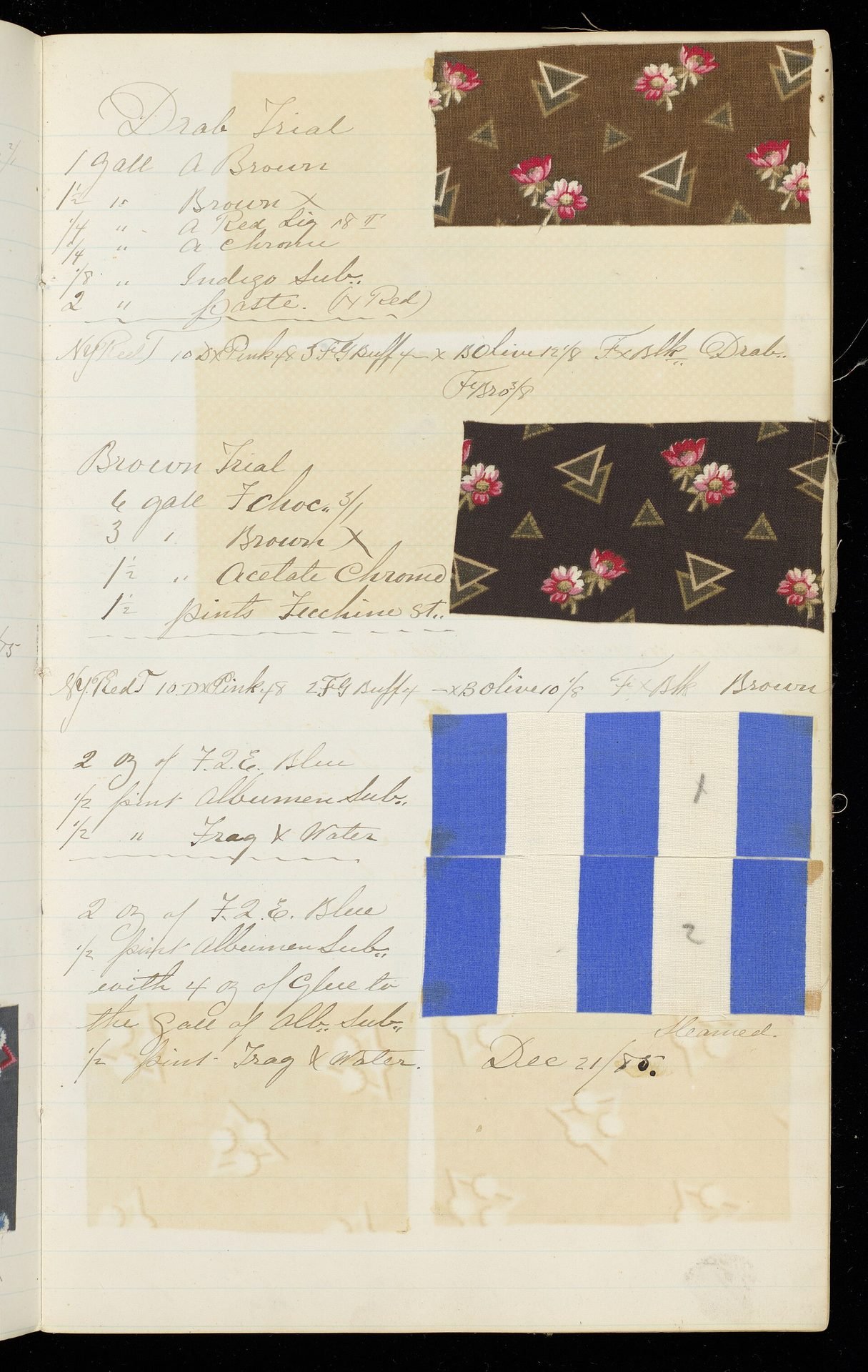
A printer's sample book, 1880s. The style has a number. The mix sits next to it. You can reorder the color without losing the style.
Say: semantic name, then the primitive it points at. The number is the contract. The mix can be corrected.
Public domain. No credit line.
If you are long, skip the commentary and let the line do it. The next slide is the mistake teams make with brand color.
A distinction
The brand color is not the action color.
BrandWho you areThe indigo, the paper, the mark. It can be rare on a product screen.
ActionWhat moves the taskOne role, checked for contrast, used when the person should act.
I keep this as its own slide because it prevents a month of argument.
Brand is identity. It shows up in the mark, in key moments, in marketing. Product UI that is soaked in brand color makes everything shout, and then nothing is the action.
Action is a job. It should be findable. It should pass contrast for the text on it. It might be the brand color. It might not. Decide, write the sentence, point the component at the decision.
Data visualization is a third job. Do not steal action and danger to mean "series three" and "series four." People learn those colors as meaning. If red deletes and also means last quarter's revenue, you have trained them badly.
Focus is a fourth job. The focus ring is not whatever the browser defaults to, and it is not the brand glow. It is a name, visible on both themes.
You do not need more columns on this slide. If someone asks about borders and surfaces, those are semantic too, and they are quieter on purpose. Quiet is not an accident. It is how the action stays visible.
Move to dark mode before the sync section, because dark is where unnamed color falls apart.
Theme
Dark mode is a second map.
Same names. New values. Checked, not inverted.
Say this to anyone who thinks dark mode is a filter.
You already named the decisions. Dark mode assigns different primitives to those names. Surface gets darker. Text gets light. Action might shift so it still clears contrast. Danger must still read as danger, not as a pretty coral that disappears into the page.
Inversion, multiplying by a magic number, or handing the theme to a plugin and hoping, will fail on borders, on shadows if you use them, and on anything that was a hex in a component. This is the practical argument for the layers. A second map is only possible if the first map is made of names.
Do the work in this order. Semantic names in light, with contrast checked. Then the dark map, with contrast checked again. Then one product path in both, not the whole app in a weekend. I would rather ship three screens that are truly themed than a toggle that washes the product in gray and leaves the modal behind.
If you do not need dark mode, do not build a fake one for the talk. The same structure gives you a white-label theme, or a partner brand, or a rebrand that does not touch the screens. The map is the point. Dark is the example people recognize.
Land: aliases are how themes stay boring. You want the theme change to be dull. Excitement in a theme change means something was hardcoded.
Every element has an address.
A periodic table, 1962. Public domain. The power is the address. You do not describe the element by how it looks today. You name the cell, and the facts live there.
Say: a token without an address will be duplicated. Color action and button blue and brand primary and link, four names, one job, inevitable drift.
Keep the set small enough that a person can remember the addresses that matter. A table of three hundred is a pile again.
Into the second half: two sources.
Part two
Two sources, one contract
The file and the repo. Checked, not mythologized.
Shift posture. The layers are the language. This part is how the language stays true in two tools.
Tell them you are about to insult a popular phrase, and that the insult is practical.
The myth
One source of truth is usually a drawer.
A JSON nobody opens is not governance. A diff is.
I want this to be clear, because teams waste a quarter hunting the perfect source.
There is no single source that designers and engineers will both live in every day. Designers work in Figma. Engineers work in the repo. A third file, tokens.json in a wiki, becomes the thing everyone agrees to respect and nobody opens. I have seen the commit. I have seen the stale export.
What works is synchronized sources. The names exist in Figma variables and in code. A check tells you when a name is missing on one side, or when a value drifted. The check can be a script, a CI step, a small test. It should fail in public. A monthly meeting to "review tokens" will smile and drift.
Say what must match. The semantic names. The component names you promised. The values for the themes you ship. What does not need to match is every exploratory swatch in a sandbox file. Exploration is allowed. The contract is the set you promised product teams.
If you use a tool to sync, good. If the tool is down, a person should still be able to read both sides and see the same words. Do not let the pipeline be the only place the names exist. When the pipeline breaks, and it will, the contract should still be legible.
The bench note, if you have a breath: we graded 898 generations across four design systems. None of them were AI-native yet. A model that reads your tokens will do better than a model that reads a screenshot of a button. The contract is also how you keep generated UI from inventing a fourth blue. Mention it as a consequence, not as the sales pitch. This talk is about the handoff you have this quarter.
Land: stop looking for the one true file. Start looking for the diff.
The contract
What has to match.
- 01
The namesColor action in the file is color action in the repo. No translation layer in someone's head.
- 02
The mapsLight and dark, or whatever themes you ship. Both sides, both maps.
- 03
The partsShared components point at the same decisions. States included.
- 04
The checkA failing diff when they disagree. Not a reminder in a calendar.
Read the four. Add one warning each, short.
Names: casing and punctuation will try to diverge. Pick a convention and make the check strict. Color.action or color-action, I do not care which, I care that you do not have both.
Maps: if dark exists in Figma and not in code, you do not have dark mode. You have a poster.
Parts: a button in Figma with six variants and a button in code with two is not a match. Write the states down and delete the ones you will not build, or build them. Pretending is how design intent dies at handoff.
The check: show them, even verbally, what red looks like. "color danger missing in theme dark." That line is worth more than a principle slide. If you do not have the script yet, a spreadsheet diff you run on Fridays is a start. Do not stay on the spreadsheet. Move it next to the pull request.
Say: this is design engineering. The token is not done when it is drawn. It is done when it ships with the component and the check.
One card. One record.
One card, one record, a stack of the same card waiting. Public domain, National Archives. The system is the repeated record, not the skill of the person on a good day.
Say: a token change should be a record you can file. Who changed action, why, which map. If the change is a silent edit in a Figma variable, the repo will not hear it, and the next release will surprise you.
Short. Then how a change should move.
One change
Follow a token through the door.
- 1
A reasonContrast, a theme, a real screen. Not a mood.
- 2
The nameChange the decision, or add one, with a sentence beside it.
- 3
Both mapsIf you ship dark, update dark in the same change.
- 4
The part and the checkThe component that uses it, and a diff that would have caught a miss.
Narrate one change as a story. Pick contrast, because everyone has shipped a button that looked fine on a laptop and failed in sunlight.
Someone notices color action text on color action is thin. The reason goes in the change, in a sentence. You do not open the ramp and nudge a hex in five components.
You decide whether action text changes, or action itself changes. You write it on the semantic token. You update the dark map in the same pull request. You look at the button, the link if it shares the role, and one real screen. The check compares the exported names to the theme in code. If Figma still has the old value, the check fails. You do not discover it in QA three weeks later.
This is the path I want a new hire to be able to follow from a short doc. If the path requires a specific person to "do the export," name that in the doc, and then try to make it boring. Bus factors love token pipelines.
Mention agents carefully. If a model proposes the change, a person still owns the name. Do not let the model invent a step on the scale because the prompt said "make it pop." The planner can list the screens. The executor can touch the files. The owner accepts the diff. That is the same governance you wanted before the tools got fast.
If you are short on time, tell only the contrast story and point at the four steps.
Holes in a row. A pattern you can file.
Jacquard cards. CC0. The pattern is punched before it is woven. The loom does not improvise the repeat.
Say: the token file is the card. The component is the cloth. If you change the cloth by hand on one screen, you have left the pattern. Sometimes you should, for a campaign, for a minute. Then you either punch a new card or you throw the exception away. You do not leave the exception as the new truth.
Very short. Next is what to keep the tools away from.
Tools
The model does not name the system.
It can draft. You accept the name, the map, and the diff.
Keep this calm. I use these tools. I also won a hackathon in 2026 with a Figma plugin that swaps mismatched components, first place at Into Design Systems. The plugin is useful because the components already have identities. A swap without a contract just moves the mess faster.
So: let a model draft a ramp, list hard-coded hex in a repo, or propose a missing semantic name. Do not let it merge a new color called brand vibrant primary soft. Someone reads the sentence next to the token. Someone checks contrast. Someone watches the diff.
Figma is more legible to machines when variables and components are real. Treat the file as structured, not as a picture you export. That is "Figma as an API" in one line, and it is a longer talk if they want it. Today, the practical bite is: unnamed layers will be misread, by people and by tools.
Land: speed is a good problem to have after the names exist.
Part three
A week you can run
No new platform. One theme, one component, one check.
Tell them this is the part to photograph, or to copy into the doc on Monday. Three days of real work, not a platform rewrite.
If their tokens are already mature, use the week as an audit: where do screens still hold a hex, where do names diverge, does dark have a map.
Monday to Friday
Name, alias, check.
- Mon
List the decisionsFrom one real flow. Action, danger, surface, text, focus. Ignore the rest of the product.
- Wed
Point the partsOne button, one field. Component tokens alias the decisions. Both themes if you ship them.
- Fri
Fail the diffSame names in the file and the repo. A check that goes red when a value drifts.
Walk the week as if you are pairing with them.
Monday: open the flow you are ashamed of, or the one that makes money. Write the decisions on paper before you open the token UI. You are not allowed to add a token that this flow does not need. Capture the hex values that already shipped, so you do not redesign the brand by accident while naming it. Put the sentences beside the names.
Wednesday: in Figma and in code, the button and the field consume only those names. Delete a local hex if you can do it safely. If dark mode is live, do the second map now, on these two components only. Look at them in both themes on an actual screen, not only on a swatch board.
Friday: export or read both sides and diff the names. It can be rough. A script that prints missing and extra is enough. Put it where the team will see red. If you cannot automate yet, do the diff by hand and schedule the script as the next small task, with an owner. A check with no owner is a doc.
Say what you will refuse this week. You will not tokenize the illustration style. You will not rename the whole library. You will not block a release on a perfect pipeline. You will leave the week with two components that cannot drift quietly.
Invite them to bring that Friday diff to a free consult if they want someone to read it. Thirty minutes, no pitch. Only say that once, here or at the end, not both at length.
This week is also the right size for a foundations sprint later, if the mess is bigger. You do not need to buy the sprint to learn from the week.
Open the drawer. Read the card.
The drawer is labeled. The card is the record. You do not browse the stacks to remember the name.
Public domain. Say: your semantic set should be a drawer a new designer can open. If it is a search through components hoping the color is on the fill, the name failed.
Into the failures, so they do not learn them the expensive way.
Failure modes
How token projects go quiet.
- 01
Names nobody saysColor interactive primary default on brand. The review cannot speak it.
- 02
A ramp with no rolesScreens shop the scale. The theme cannot be remapped.
- 03
Sync as a personOne designer exports on Fridays. Then they take a holiday.
- 04
Component hex in disguiseThe token exists, and the screen overrides it.
Four ways I have watched this stall. Be specific so they can confess one of them.
Names nobody says: if the token name needs a glossary, it will not be used in critique. Short words. Action, danger, surface.
A ramp with no roles: the file looks systematic and the product is still choosing blues by eye. Roles are the product.
Sync as a person: admirable, and fragile. Write the steps down this week, even if the person still runs them. Then replace the heroics with a check.
Overrides: Figma lets you detach. Code lets you pass a style. Both are escapes. Count them. An override with a reason and a date is a decision. An override from six months ago is the tax.
I would add a fifth only if asked: documenting tokens in a Notion page that restates the JSON. Docs that do not read the source will drift. Write the sentence in the token description, where the change has to touch it. The longer version of that idea is in the governance talk.
Do not pile on. Ask which of the four they already have. Then close.
Honest next steps
Pick one flow. Name its decisions.
Leave with a list of roles, not a new library ticket.
Monday instruction, crisp.
Choose the flow. List the decisions in words. Mark which ones are still raw hex in the repo. That list is the work. It is smaller than "implement design tokens," and it is the real work.
If the list is long and political, that is a sign you need an owner, not a workshop about color psychology. Brand can help pick the primitive. Product design and engineering pick the roles together. One of them has to accept the diff.
The consult is there if you want the list read by someone who has done the seam. Get a free consultation. Thirty minutes. I will tell you if the leak is tokens or if it is really governance, adoption, or a product problem wearing a color costume.
Other talks: the tax, if you still need the budget story. Governance, if the names exist and nobody uses them. Design engineering, if you are hiring for this seam and keep getting front-end generalists.
Stop before you restate the layers. They have them.
Design Engineering Studio
Name the role. Then point the hex.
The check is the rest of the craft.
christophhellmuth.com
Read the line. Stop.
Questions next. If you need a last bridge: a token that cannot be said out loud will not survive the handoff.
Stay on this slide while hands go up, or advance to the prompt if you prefer it behind you.
Questions
Which name do you not have yet?
Action, danger, surface, focus. Or the check that would catch a drift.
Prompt the room with the question on the slide.
If they ask which tool to buy: the tool is fine if the names stay visible in both places and the check is yours. I will not spend the answer on a vendor. Ask what happens when the sync job fails on a Friday.
If they ask about spacing and type: same layers. A primitive scale, semantic use such as stack and inset and body, component use such as button padding. Do not invent a space token per screen.
If they ask about migrating a large app: one flow, like the week. Then the next flow that shares the button. Migration by screen, not by a flag day that tries to replace every hex in the repo. Flag days slip, and the old hex stays in the exception.
If they ask whether Figma variables are enough: they are enough on the design side. They are not the repo. Both, and the diff.
Close the half hour on the line. Name the role. Then point the hex.
The timings include this conversation. Start the questions while you still have five minutes, not after you have used them on the layers.